You don’t need a huge space to design it well. I’m sharing tips on how we redesigned our living room in a small area.
Read our small house ideas for the living room and get inspired to makeover your small living room space!
Small House Ideas For The Living Room
We moved into our home over nine years ago. When we first moved in, things like having a huge kitchen, ample space for entertaining, and a ton of natural light didn’t register with us. Our home is about 1500 sq feet.
However, after hosting dinner parties, Christmas dinners, and more, we need more space.
But what happens when you have a small home, and you look wistfully at all of the beautiful big homes on HGTV or home decor blogs?
You get house envy. Then one day, while watching another episode of my favorite show, Love It or List It, Hillary Farr said something that has stuck with me for the last few years.
She said, “You don’t need a huge space; you just need to design it well.”
I’ve watched Design on a Dime, Fixer Upper, and many other Home Decor shows on HGTV throughout the years. Derrick is also into home design, and we have both learned to blend our styles to create our home.
I feel we’re still growing and learning new things day by day.
With a small house, you don’t have a lot of space. We’ve redecorated our living room several times over the years.
When we moved into our home, the walls were painted eggshell and brown oak paneling (talk about UGLY).
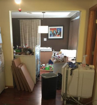
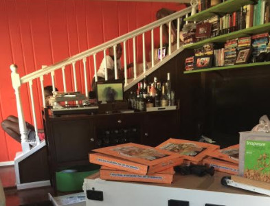
Here’s a look at our old living room (taken when we were redoing our kitchen)
Another look at our old living room, taken while we remodeled our kitchen.
Paint The Walls For a Fresh Look
The first thing we did was fill the slats with mud. Derrick sanded them down to give them a smoother look and painted the walls brown.
That was our first mistake. Painting our walls brown made our living room smaller, but we thought we were doing something. (Lol)
Over the years, we upgraded our couch to a white leather sectional. It lasted for a while, even with three boys.
However, I still felt that our living room lacked something.
When we remodeled our kitchen (a post about this is coming soon), we knew we had to redo our living room (again).
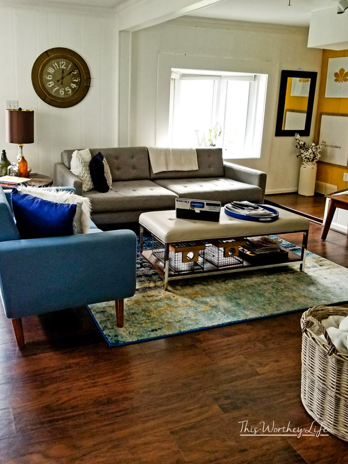
We started by painting the walls white. This helped brighten up the room.
Tip: I highly advise painting your walls white or a super light color if you have a small space. This will help open up the room to feel bigger.
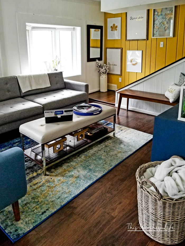
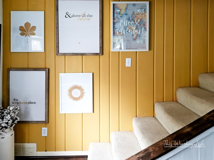
We decided to make our wall by the stairs an accent wall.
It’s painted a gold color. At first, I was a little skeptical of the color, but the hubs won. (Between you and me, I love how it turned out!)
Buy Furniture That Will Fit Your Space
After painting the walls, we thought about what type of furniture would fit into this space.
We wanted modern furniture with the capability of enduring three boys and dogs while entertaining guests throughout the year.
Let me tell you, picking out furniture and a new rug takes time.
Don’t ever feel you have to rush to make everything happen.
Plus, the dollar signs can rack up fast when trying to redo an entire space.
We started to add our pieces of furniture a little at a time.
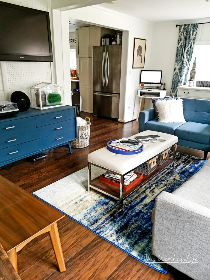
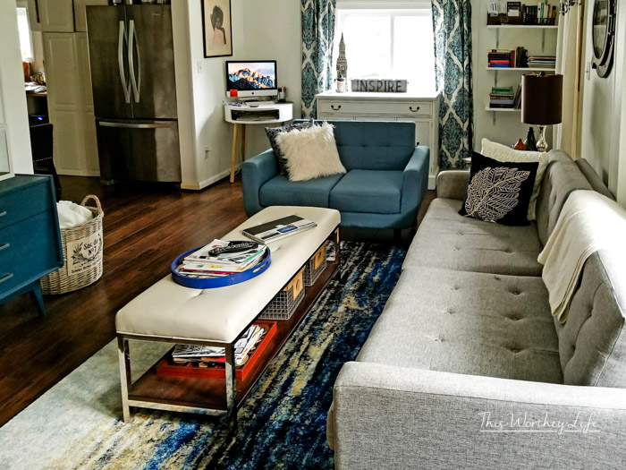
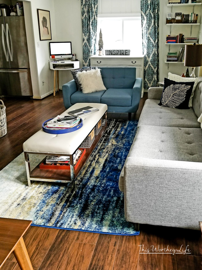
We decided to go with two pieces: a loveseat and a couch.
When picking out a loveseat, I wanted something that would fit a modern mid-century style (like our T.V. Console).
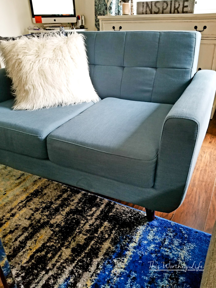
And with hints of blue throughout the room, this Payne Grey Langley Street Magic Loveseat was a great fit.
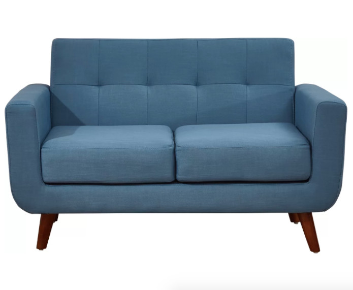 Thank you to Wayfair for providing us with this loveseat.
What I like about this loveseat received from Wayfair is how easy it is to clean.
It’s comfortable to sit or lay on ( my boys always lay on it).
With slanted legs, it pays homage to the mid-century design, along with a clean-lined silhouette with curves in the right places.
With our space, every piece of furniture of matters.
I’m happy with how well our loveseat fits into our area, and I love the color.
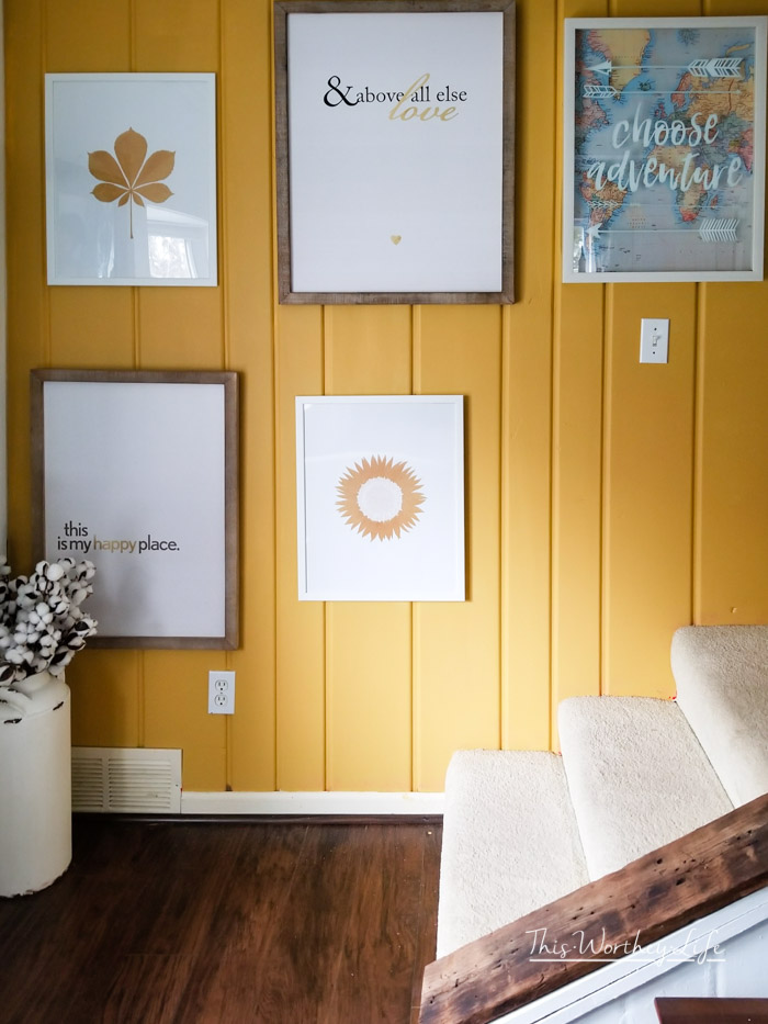
I love signs, so we slowly added signs here and there. I picked signs that I felt would bring inspiration into our home.
I love ordering products from Wayfair
When ordering from Wayfair, I received free shipping, and it was easy to put together.
The loveseat arrived in a big box. All I had to do was bring it into the house and put a few pieces together.
I had to twist the legs on and connect the sides and back. It took less than five minutes.
Yes, Wayfair had what I needed, with affordable prices and beautiful pieces.
We’ve ordered from Wayfair before, purchasing our first set of dining room chairs two years ago, and then with our most recent dining room change- more dining room chairs!
Ways To Make Your Space Feel Bigger
Behind the T.V. is a pegboard wall. We put this in when we initially moved in and painted the pegboards white.
We plan to take it out and put up a shiplap wall eventually.
We ripped out the banister earlier this year. This is another tip for making your space feel bigger. If you have a small space, removing things that cause a room to feel divided or smaller is a great idea.
When we removed the railing, it didn’t add additional footage to our living room, but it feels bigger.
The living room appears to be expanded wall to wall versus the wall to the banister.
We also plan to pull up the carpet on the stairs and put in hardwood stairs. (as well as put up a handrail on the wall side for safety)
We added a temporary bookshelf to the back of the living room wall. It’s made out of wood planks (painted white), evenly spaced out in a corner tucked out the wall.
Eventually, we plan to redo the bookshelf to add more space for our books, magazines, and knick-knacks.
Another tip: when designing a small place, don’t overcrowd it with a ton of stuff. This will make your space feel even smaller. Keep things to a minimum.
When you put together a design for a small space, every piece of furniture and use of space matters.
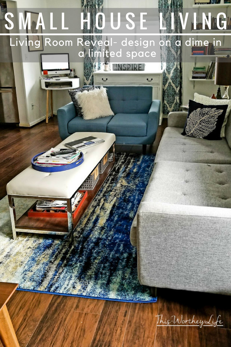
We added a narrow coffee table that also serves as a bench for additional seating (if needed). Underneath are wired basked for extra storage.
When we changed our dining room table, it came with a bench.
The bench was too cumbersome in our dining room, so we put it in the living room.
It serves two functions- additional seating and a place to put decor items (when needed).
{photo credit: Erin/Painted Teal}
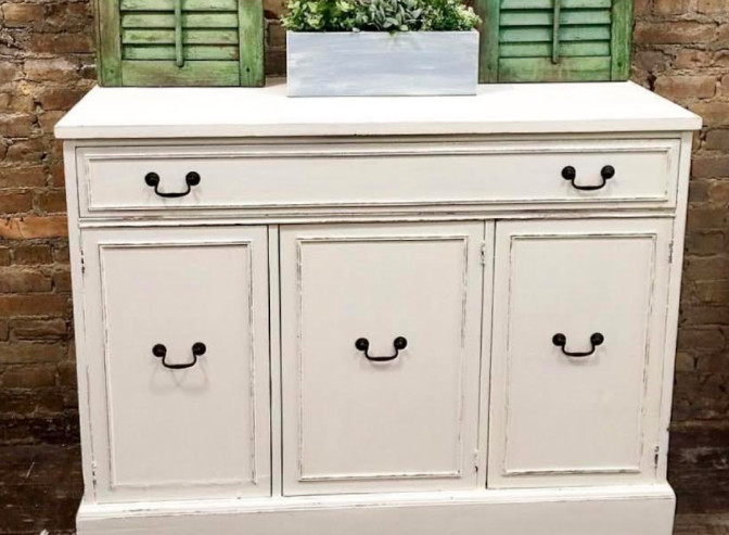
Towards the back, we added a beautiful old dresser turned into a side buffet. I love the shabby chic style, but I don’t want it to take over my house.
So, we’re adding a few shabby chic items to our modern space. My friend, Erin from Painted Teal, will take older pieces of timeless furniture and do a fabulous custom paint job.
A few ways we saved money on our design was to look for local pieces, like our side buffet and side console.
We also used online stores like Wayfair to find great pieces at budget-friendly prices.
We tried to do as much of the work ourselves to save money.
My husband helped the contractor put the laminate floor in.
This saved money on labor, and putting in laminate floors versus hardwood floors also saved a ton of money.
Hillary Farr also mentioned in an article I read recently, “People love space. They tend to think that bigger is better,” but that’s not necessarily true, she said.
How you design your home makes all the difference in the world when it comes to small house living.
Summary of what we did:
- We painted our living room walls white. This makes this space feel brighter and bigger.
- We took down the banister. Taking down banisters and/or walls that could block extra space/height will help your space feel bigger. (To be up to code, we will install a rail on the opposite side).
- We took our time hunting for the right furniture and rug to fit our space.
- We looked for furniture that could double as storage and additional seating.
- Don’t fill your space with a ton of stuff; space things out accordingly.
- Make a plan and budget on how much you will spend on your remodel.
Find more home decor ideas for small house living
Photo Gallery Wall | Small House Living


AnnMarie John says
I LOVE the way it turned out. I plan on redoing my living room in about a year. We’re right now focusing on outside. We redid the front yard and now want to do the back and install a mini kids playground complete with swing etc. We’re limiting our travels next year so we can focus on that since it’s going to cost a pretty penny. We’ll see how it all goes next year.
Stacie says
That is such a great space! I love the final product. I always enjoy a space that incorporates storage wherever possible. We all need it!
Donna Chaffins says
It turned out beautifully! We have a guest room that is small and your tips will help me make it look bigger! I’ve painted every room in my home a color other than white for years now, but I’ve been wanting to go all white walls again, just a little nervous about it for some reason. 🙂
Sherry says
I love what you did with the space. We also have a smaller living room and we have cumbersome furniture. I need to change it up.
Toni | Boulder Locavore says
I love how it turned out! These are really awesome tips!
Vintage & Specialty Wood says
Fabulous transformation, indeed! I love all your brilliant ideas. I will try to use it at home. Thank you for sharing! Great work!